Display the JCB Corporate Logo with a white outline only when it has low visibility displayed in JCB Blue, black or reverse due to a complex background.
JCB Corporate Logo: Regulations for Display in Relation to Background Color and Prohibited Display Applications
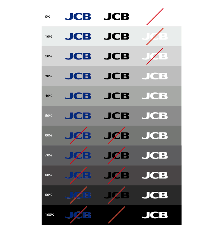
Relationship of Display Color to Background Color Brightness
Some benchmarks for display variations depending on the brightness of the background color are shown below. Although the backgrounds are displayed in achromatic tones here, you should apply these criteria appropriately when employing complex backgrounds, such as chromatic colors or photos.
Special Cases

Prohibited Application Examples
Employing the JCB Corporate Logo in ways other than those specified by the regulations will damage the brand image and value. Some clearly incorrect application examples are shown below. Always use the JCB Corporate Logo properly and with due care.
Prohibited examples |
||
|---|---|---|
Do not distort. |
Do not alter the color. |
Do not display the gradations in single color. |
Do not change the spacing. |
Do not employ a vertical layout. |
Do not violate the isolation space. |
Do not enclose within shapes. |
Do not use open-face lettering. |
Do not add letters or words. |
Do not tilt. |
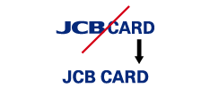
Do not display the JCB Corporate Logo within a unit of text. |
Do not display the JCB Corporate Logo in three dimensions. |